Project Overview
Client: Carillon ERP
Product: Corporate / Marketing Website
Role: Solo UX/UI Designer & Front-End Developer
Responsibility: Stakeholder Interview, User Research, UI Design, Front-End Development
Duration: 2015 – 2018 (ongoing improvements)
Team: Business Owner, Marketing Team
Tools: Adobe Illustrator, HTML, CSS, JavaScript, Accessibility Audits
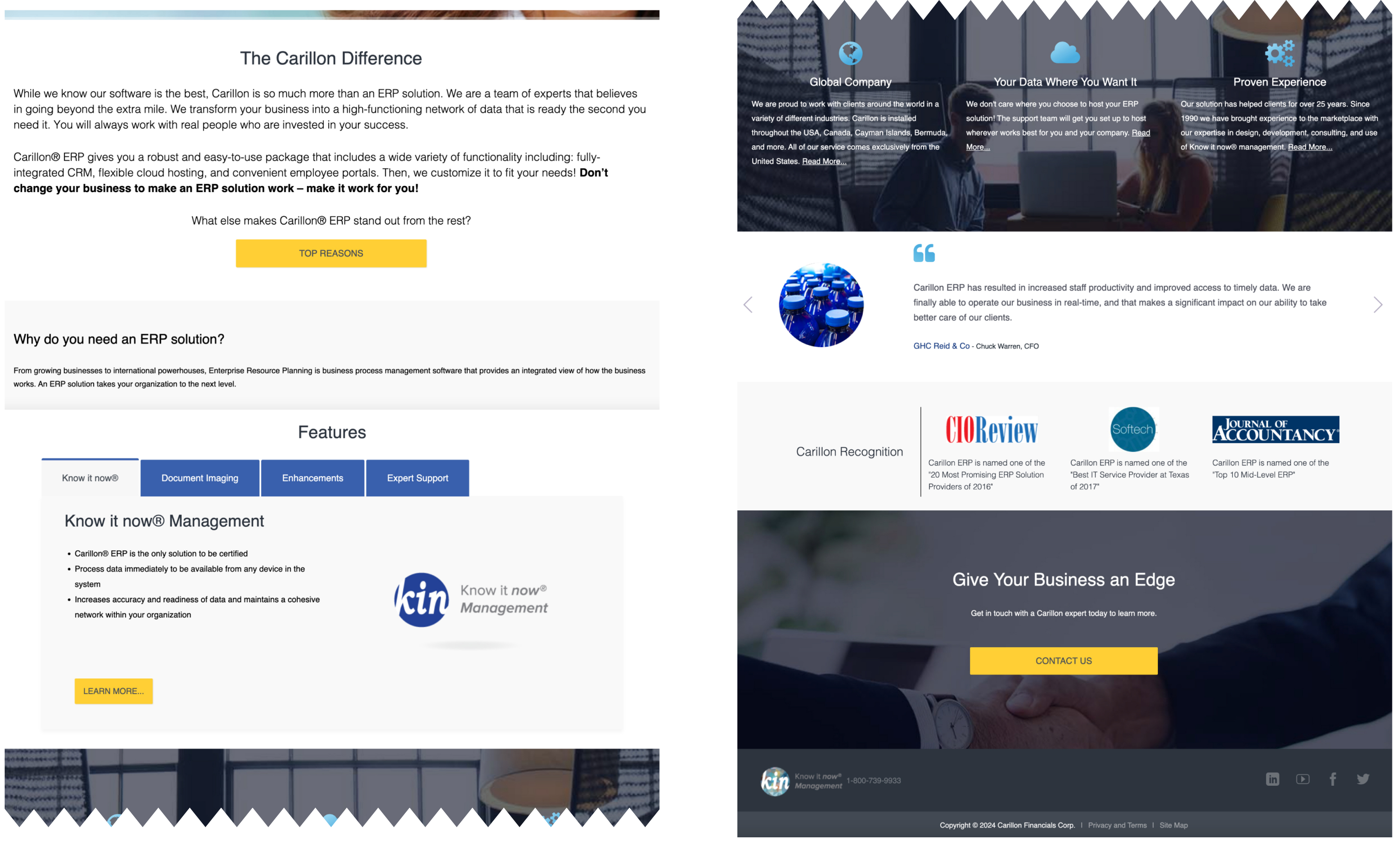
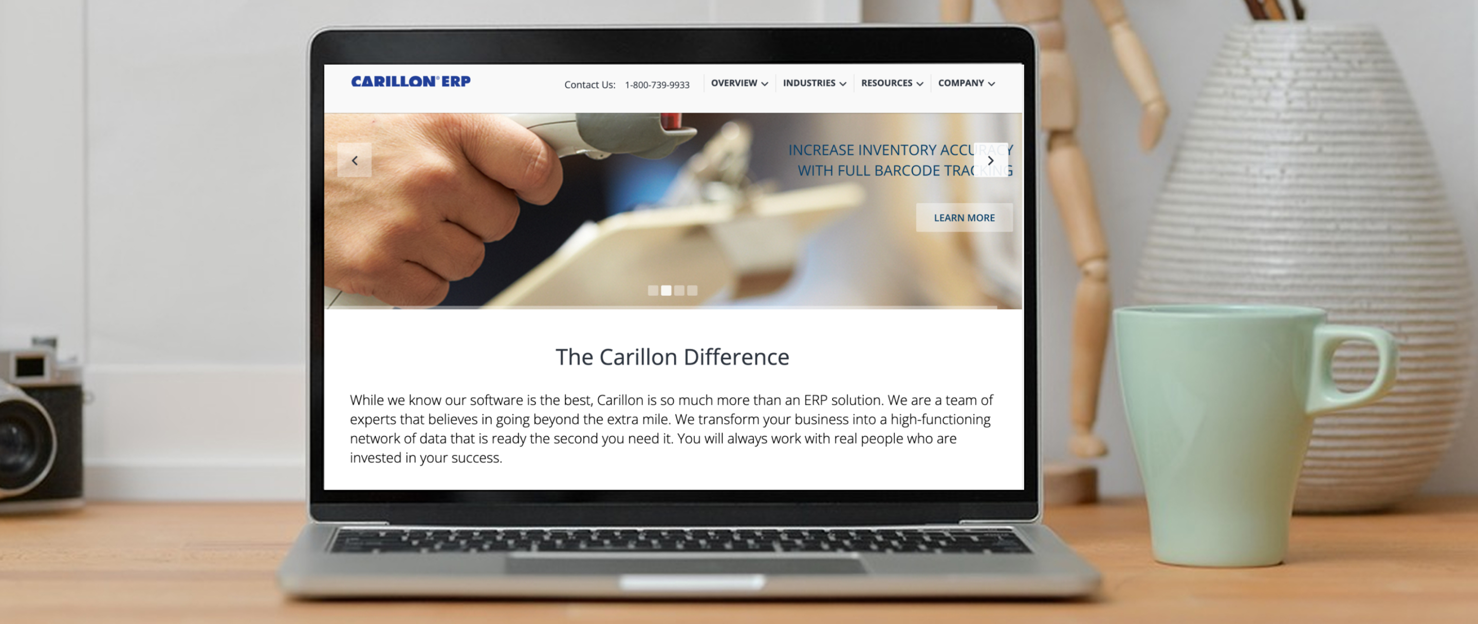
This project focused on redesigning the company’s corporate website to improve brand consistency, accessibility, and overall user experience while supporting business and marketing goals.
The Problem
The business website experienced low engagement and high drop-off due to usability barriers and unclear information hierarchy. This impeded user trust and conversion for ERP-seeking visitors.The business website faced several usability and engagement issues:
- Poor readability (small fonts, alignment problems)
- Navigation confusion and redundant links
- Insufficient content, leaving users unsure how to proceed
- High drop-off and low engagement that hurt conversions
These issues made the site hard to use, reduced trust in the brand, and failed to support key user goals.
Research & Understanding Users
To identify the core problems, I:
- Reviewed existing site analytics to understand user behavior
- Evaluated usability issues through heuristic assessment
- Collected informal user feedback to identify pain points
Key insights:
- Users struggled to scan and absorb page content
- Important calls-to-action were not clear
- Navigation labels didn’t match user expectations
Instead of jumping to visuals, I grounded design decisions in real user needs and behavior.
Design Approach
The redesign centered on clarity, accessibility, and user needs, strategically reorganizing content to prioritize quick answers over mere aesthetics.
- Increased font sizes and refined typography for readability
- Improved layout hierarchy and spacing
- Simplified navigation to reflect user language and expectations
- Removed redundant links to reduce cognitive load
These changes helped users understand what the site offered and how to get there.
Design Solution
Visually and functionally, the redesign achieved:
- Clear content hierarchy: Primary info presented first with helpful subheadings
- Accessible experience: Better contrast, readable fonts, larger click targets
- Consistent branding: Strong visual identity across pages
- Meaningful interactions: Buttons and links work intuitively and predictably
Business Impact
- Made the website easier to scan and navigate
- Reduced user confusion and frustration
- Better aligned content with user needs
- Supported business goals by improving the site’s ability to communicate value and convert visitors, resulting in a 30% increase in web traffic
Reflection & Key Learnings
This project taught me the importance of:
- Prioritizing content and usability over aesthetics alone
- Structuring information so users can scan with confidence
- Validating design choices with real issues and feedback
Strong UX is not just visual polish — it’s intentional structure and understanding why users behave the way they do.