Project Overview
Client: Mouser Electronics
Product: Internal ERP order entry Web App
Role: Lead/Solo UX/UI Designer
Responsibility: UX Research, Interaction Design, Information Architecture, Usability Testing, UI Design
Duration: 2018 – 2023 (ongoing iterations)
Team: Sales Team, Business Stakeholders, Developers, Project Manager, Business Analytics
Tools: Figma, Axure, XD, User Feedback Sessions, Stakeholder Reviews
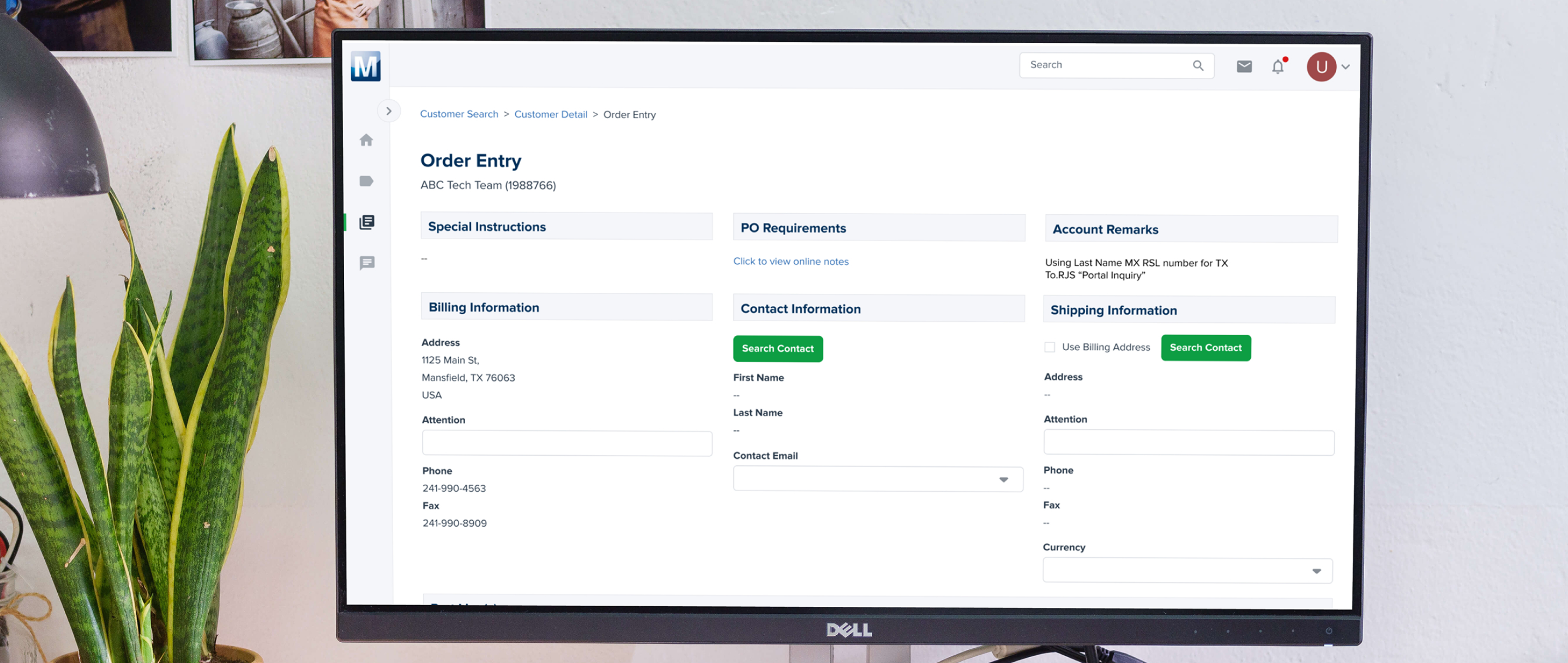
The Order Entry Form is a core internal tool used daily by the sales team to create, review, and submit customer orders. The system plays a critical role in sales efficiency and accuracy.
Business Goals
- Increase sales team productivity
- Reduce team turnover by improving daily workflow experience
- Make the system easier to learn, especially for new hires
- Reduce errors in order creation without sacrificing system flexibility
The Challenge
The legacy order entry form was complex, time-consuming, and difficult to learn. Sales representatives struggled with:
- Unclear field labeling
- Poor layout hierarchy
- Dense, data-heavy screens
- Unnecessary steps that slowed down order creation
These usability issues increased cognitive load, caused frequent errors, and led to frustration — particularly for new team members who required extensive training just to become proficient. Over time, this negatively affected both productivity and retention.
Research & Insights
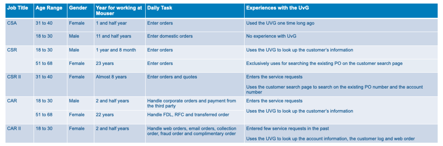
To understand the root of these issues, I conducted independent user research including:
- Field studies
- Sales training
- One-on-one interviews
- 8 sales representatives
- Mix of new hires and experienced users
- Age range: 18-60
Research Goals:
- Identify key pain points in the current order entry workflow
- Understand how new vs. experienced users approach order creation
- Discover which steps caused the most confusion, errors, or delays
Key insights:
- Users spent significant time scanning the form to find required fields
- Important inputs were visually buried among low-priority information
- New users struggled to understand the difference between same-day orders and scheduled orders
- Error recovery was unclear, increasing anxiety during order submission
In addition to qualitative research, I worked with business analytics data to understand usage patterns, such as the frequency of scheduled orders versus same-day orders, which directly informed layout and interaction decisions.
Design Process
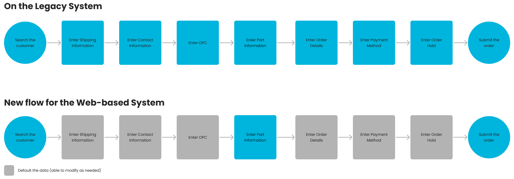
1. Workflow Analysis & User Flow
I mapped the existing workflow and identified redundant steps and unnecessary field switches. The new flow focused on:
- Logical grouping of related fields
- Clear progression from start to submission
- Minimizing back-and-forth actions
2. Information Architecture & Wireframes
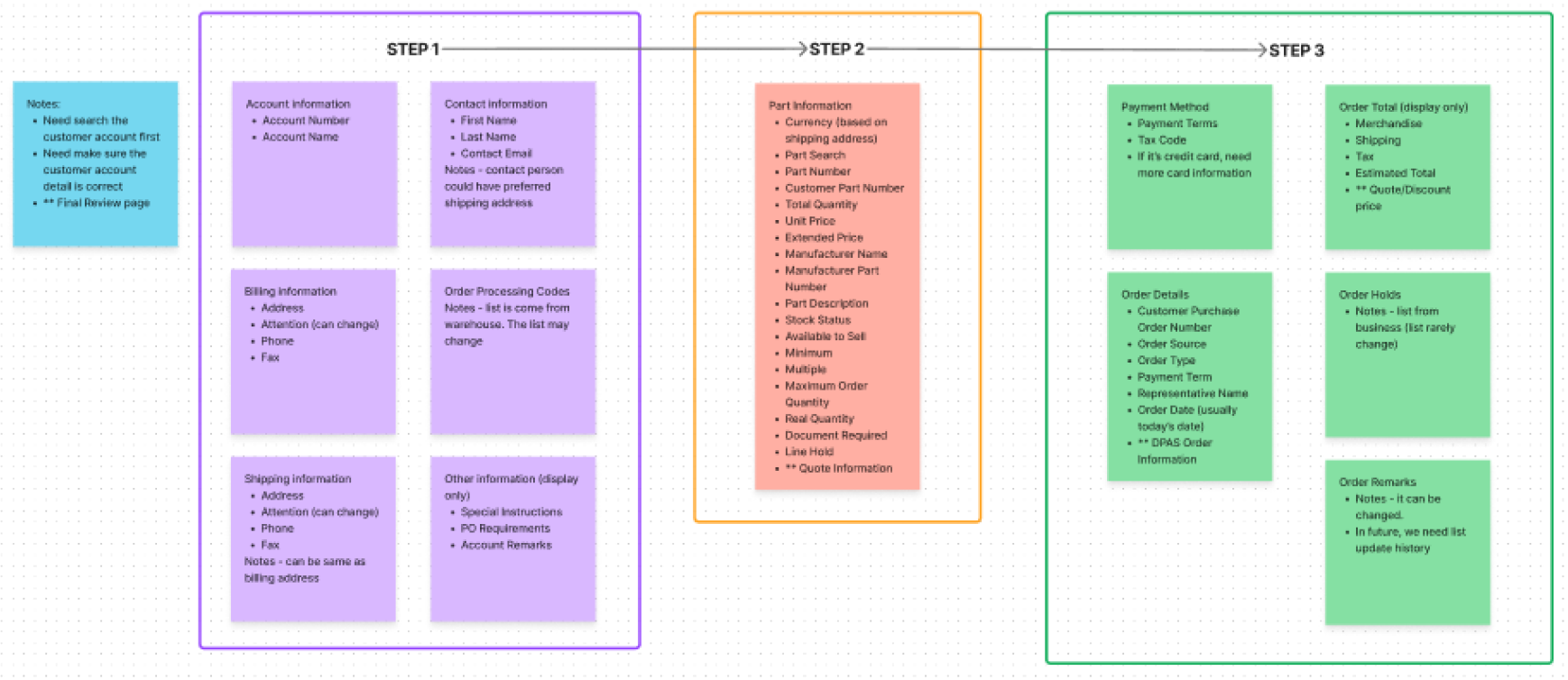
Low-fidelity wireframes were created to test layout and structure before moving into UI design. This helped validate:
- Field grouping
- Section hierarchy
- Error-prevention logic
Feedback was gathered early from sales users to ensure the design matched their daily needs.
3. UI Design & Iteration
The final UI focused on:
- Clear visual hierarchy
- Consistent spacing and alignment
- Improved form readability
- Inline validation and feedback
Design decisions were continuously validated through usability testing and comparative analysis:
- Conducted task-based usability studies to measure effectiveness and engagement
- Ran A/B tests comparing the redesigned experience with the legacy system
- Evaluated task completion speed, error rates, and user preference
Feedback from these sessions directly informed refinements, ensuring the final design addressed real pain points rather than assumptions.

Final Design Solution
The final solution used a modular, progressive layout that:
- Broke the form into clearly defined sections
- Prioritized critical information first
- Reduced visible complexity without removing functionality
- Allowed experienced users to move quickly through familiar steps
Key Improvements:
- Clear visual hierarchy and section grouping
- Reduced need for scrolling and scanning
- Better alignment with users’ mental models
- Fewer input errors through improved structure and labeling
Results & Impact
The redesigned Order Entry Form delivered meaningful, measurable outcomes:
- 40% increase in sales team productivity
- 50% decrease in team turnover
- Faster onboarding for new sales representatives
- Reduced frustration and increased confidence when creating orders
Users consistently reported that the new experience felt clearer, faster, and easier to use — transforming a previously frustrating system into a reliable daily tool.

Design System & Accessibility
As part of the ongoing product improvement, I managed and maintained the design system for the ERP platform:
- Ensured consistent UI components across the system
- Followed WCAG accessibility guidelines
- Reduced design conflicts and inconsistencies by 30%
- Improved design efficiency for both design and engineering teams
Key Learnings
This project reinforced the importance of grounding design decisions in real user behavior and business impact. By focusing on clarity, usability, and validation, I delivered a solution that not only improved the user experience but also positively impacted team performance and retention.